Scott White Contemporary Art Gallery, La Jolla CA
David Adey’s solo exhibition initially reads like a group show, with its seemingly incongruous collection of aesthetics and mediums. It is aptly titled, as viewers get the impression that Adey is more inventor than artist, meandering here and there, testing his ability to bring any idea to actualization. The result is an exhibition of strong work that pulls in a few distinct directions.
Like much of Adey’s older work, critiques of pop culture and consumerism are still strongly present throughout the space. It is two of his newer works – the sculptural installations – that are the most compelling additions to this conversation. In “Flock” and “Fill My Cup,” Adey’s standard critique hits uncomfortably close to home, with religious overtones that are difficult to miss.
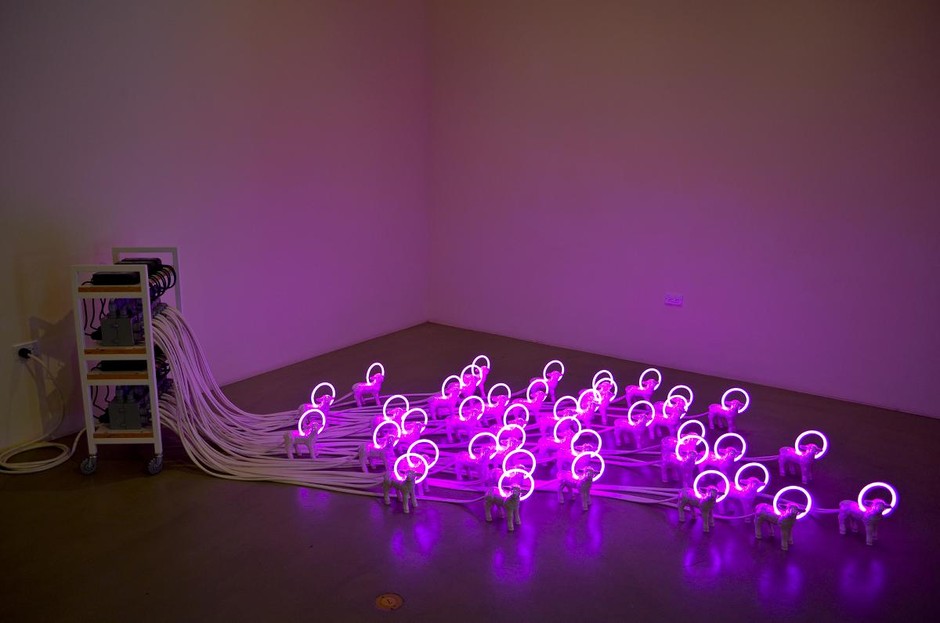
“Flock” consists of 40 miniature ceramic lambs, each one identical to the next, with neon halos sprouting from their heads. Emerging from each lamb is a conspicuously thick electrical cord, tethering them to a power source. On one hand, the ceramic lambs are all made from a single mold. They are all powered and sustained by a single source. They appear to be carefully, individually crafted. If this is a symbol of the church, it could very well be a positive one. On the other hand, the fluorescent pink lights are gaudy and the ceramic lambs kitsch. Instead of exuding a soft, illuminating, pure light (as one might expect from a halo), the fluorescent pink taints everything it touches. The visual affront of 40 glowing lambs permeates the entire room, is reflected in the glass of the surrounding wall hanging pieces, and makes your eyes hurt just a bit.
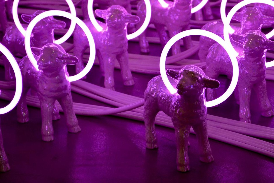
The lamb is one of the primary Christian symbols, but it is also an Orwellian symbol of simplemindedness and conformity, as well as the first animal in history to be successfully cloned. The flock with halos is clearly referencing a sort of contemporary Church, and the implications don’t appear complimentary. The work takes the very basic Christian notion of being made in the image of God, and questions how we are stewarding that gift. While we strive for Christlikeness, is our obsession for legalism tethering us instead of freeing and empowering us? While we are made in the image of God, do we appear to be cheap, visually insulting copies? What sort of light are we sending out into the world?
The other large installation, entitled “Fill My Cup,” stands 14 feet tall in the center of the gallery. It is a telescope of containers fit snugly inside each other, each slightly larger than one below it, narrowing down to a tiny, precarious communion cup which holds up the entire tower. It is impressive that this weighty stack of containers can be supported by the smallest among them. The idea that the communion cup is overflowing, exceeding its logical volume, is a powerful image. It is a beautiful visual analogy to the way a communion cup not only holds wine, but also the symbolic blood of Christ, and the salvation of all believers.
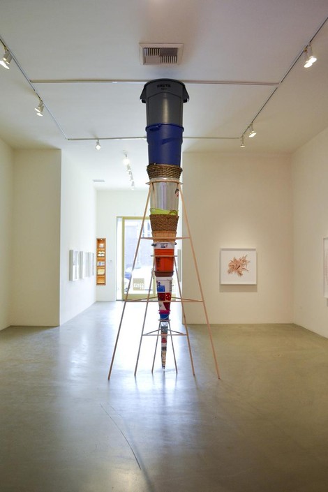
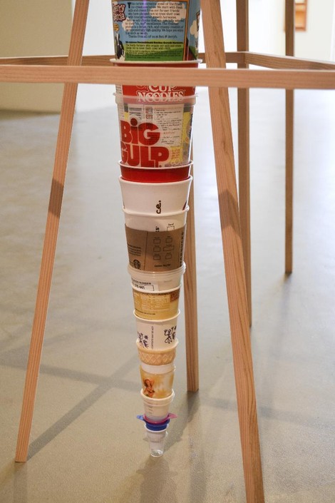
The cups that Adey chooses to nest together, however, are not what we should be filling our cup with. Not only is there a sense of dissatisfaction in the work – we are filling our cup with an ever slightly larger cup – the critique of consumerism is blatant. Easily identifiable in the work are empty coffee creamers, a shot glass, an ice cream cone, a Starbucks cup, and a KFC bucket. In case the fast food containers don’t carry their point strongly enough, topping the stack is the largest trashcan Adey could find. Like “Flock,” this installation presents a theology that has the potential to be empowering, and then suggestively critiques how the modern Church is interacting with that truth. Our cup is running over, but with all the wrong things. The symbol of communion, a small plastic cup that serves no other purpose than to remind Christians of the sacrifice of Christ on the cross, is filled with trash. At best, we can read this work as the blood of Christ supporting and upholding all other facets of our life, however menial or trivial. At worst, a societal preoccupation with acquiring “spirituality” has turned the sacrament of communion into something disposable.
The rest of the show primarily consists of Adey’s cutouts. “Gravitational Radius,” “Starbirth” and “Superstar Collapse” are magazine cutouts of celebrity arms, legs and lips, arranged into flowers and supernovas and pinned onto foam boards. They are tangles of limbs and skin tones, the repetition lending them a sense of gravity. As Lauren Buscemi writes in the exhibition catalogue, the “deconstruction of mass media images forces viewers to explore the impact those [magazines] have on self identity.” These works are typical of Adey’s process and aesthetic, and are what he’s primarily been known for these past few years.
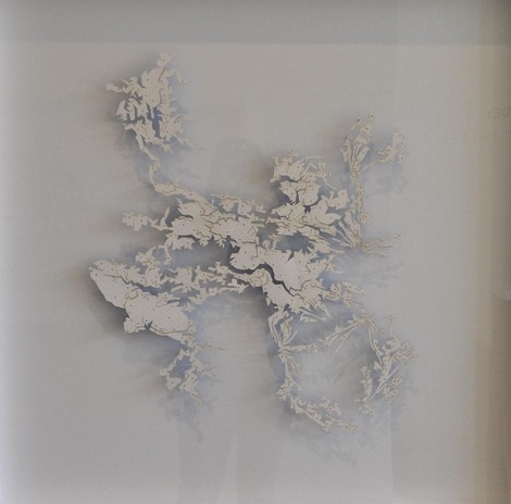
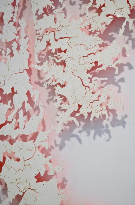
The other wall hanging cutouts are a new project Adey has been working on during his residency at Scott White Contemporary. He has scanned and deconstructed the planes of his body – hands, head and an impressive full bodied “Hide” – and translated these 3Dimensional scans into intricate 2dimensional planes of triangles. The resulting lasercut forms are suspended slightly from their backgrounds. It’s beautiful, clean work; simultaneously complex in its creation and minimalist in its presentation. The delicate paper hides are held up for contemplation by dissection pins. They have the familiarity of butterfly boxes and insect boards, of frogs carefully splayed open in a high school biology class. They are abstract forms that read like topographical maps or geometric Rorschach tests.
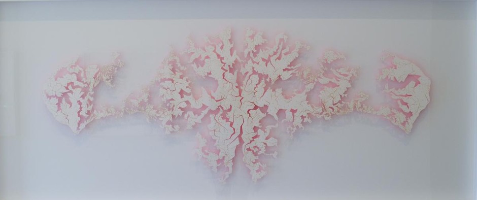
The white cutouts suspended slightly from the white foam backgrounds make the glow emanating from the presumably fluorescent backs of each cutout particularly beautiful. It is in these works that Adey’s graphic design background shines through. The forms are abstract, angular, and, despite their complexity of shape, minimalist and crisp in their exploration of color. Through the flattening of human shape and color, Adey has not only discouraged the viewing of these pieces as self portraits, he has opened up the reading of the work to ideas about terrain, the earth, and the heavens. The triangulation still visible on the final pieces hints at their process, the idea that something three dimensional has been transcribed onto a flat plane, while leaving enough mystery about what that original object is. The resulting pieces could just as easily be celestial or topographical maps as maps of the artist’s body.
While these works may be the most traditionally beautiful in the exhibition, I found them to be the least dense conceptually. There are elements of the universal and personal, as Adey’s “Hide” would look roughly identical to the flattened body scans of any other individual, but beyond that the pieces are primarily an exercise in beautiful forms, materials, and technique.
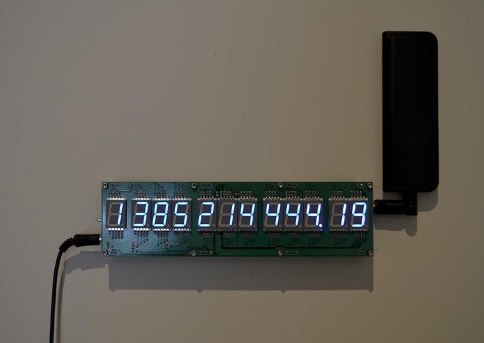
Also worth noting is Adey’s “Life Clock.” Through a complex series of estimations (based on things such as the amount of red meat eaten, or the smoking and religious habits of the subject) Adey has pinpointed the possible date and time of his own death. “Life Clock” is continually counting down to that moment.
Adey has established himself as an accomplished studio artist and inventor, and overall this exhibition was filled with strong, well-executed pieces. It would be enjoyable to see all of these divergent concepts pushed further in the coming years, with exhibitions formed around each of them.